|
|
|
|
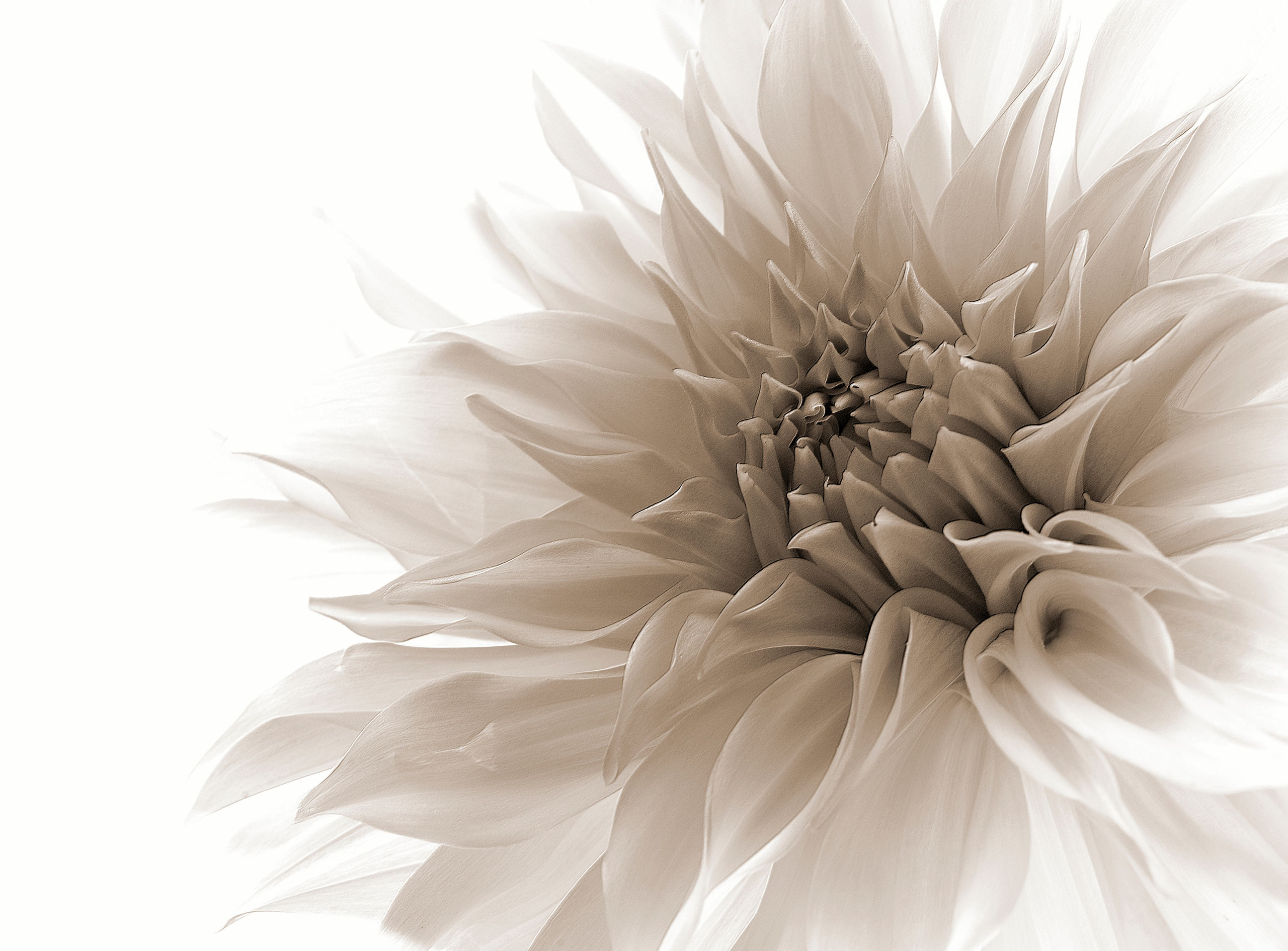
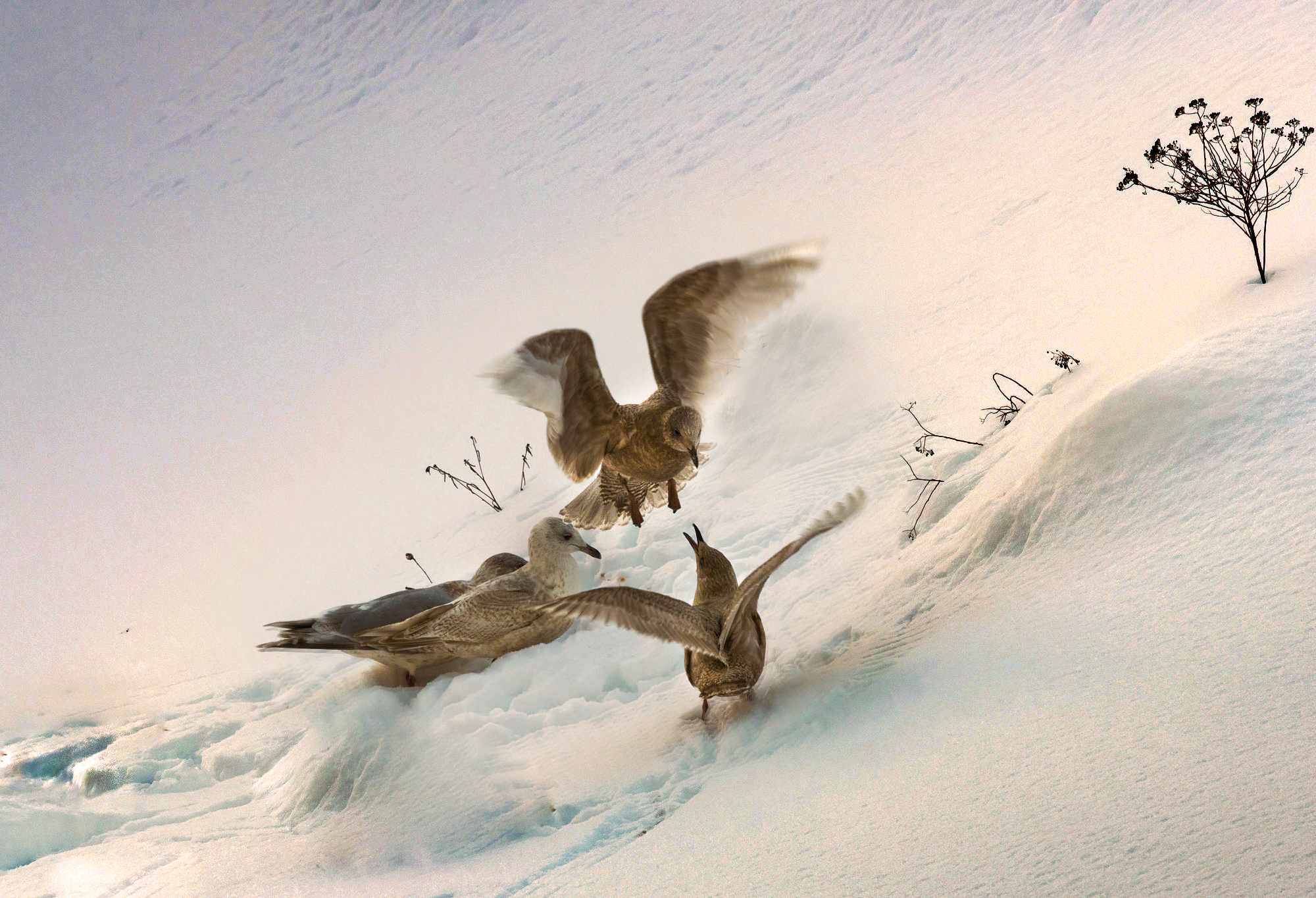
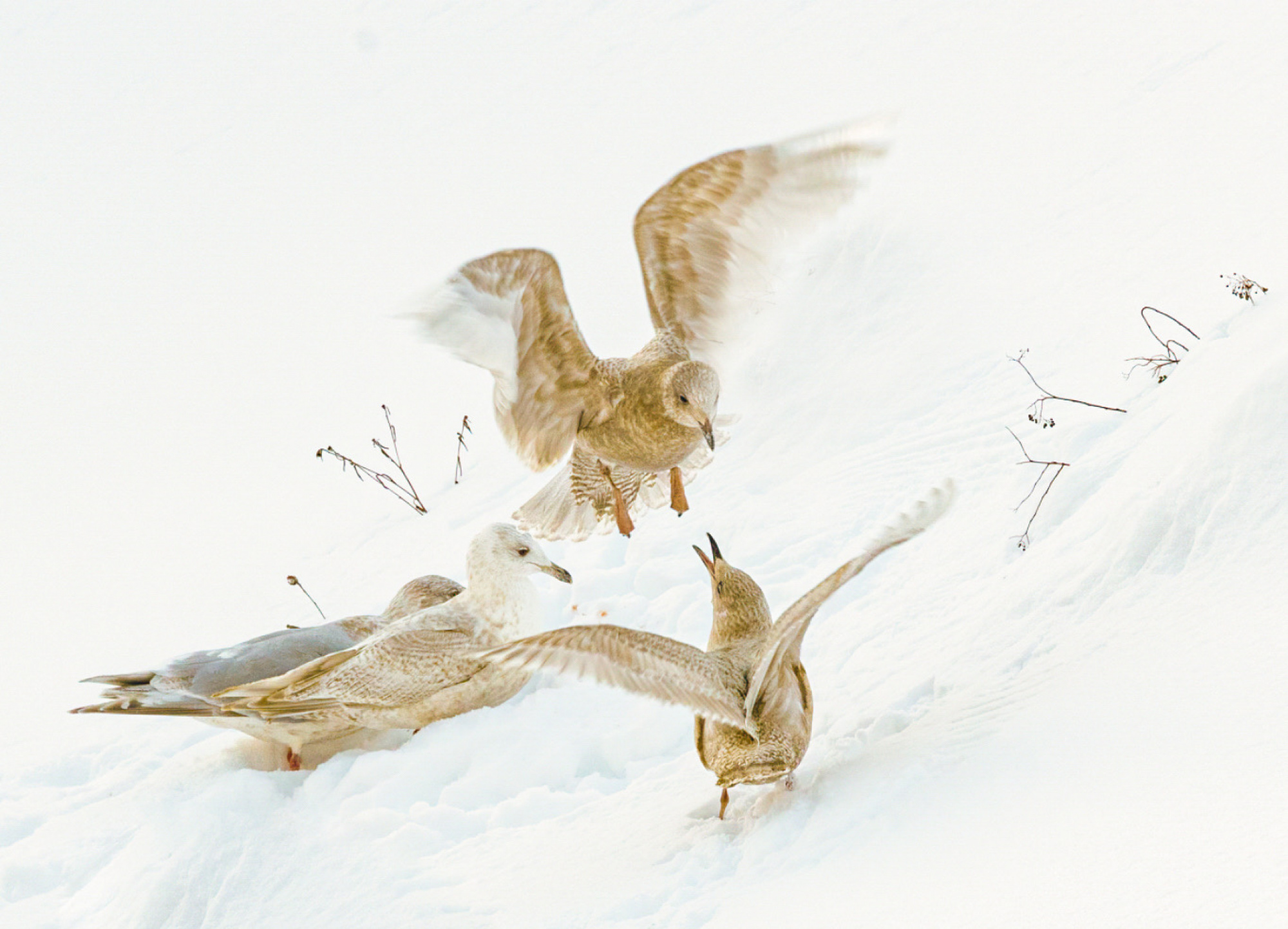
Shot at f11, ISO 800, shutter speed 1/500 sec. Intentionally exposed to the right. I was looking for a more painterly style so the snow is more blown out. Looking for those second set of eyes feedback. Thanks, Kim


Kimberly,
High-key is not my first priority but I played a little bit with your composition and I think in a strange way. I show you 3 images the first and third are possibilities the second is only to explain what I did. The first one. I brought him in camera raw and darkend. You become much blue in it and I used the pipette of the white balance to reduce the blue.. With the radial gradient I darkend the birds a fraction. But the left upper and right lower triangles were not white enough. I selected them each after another with the lasso and above the stumper on 60px for soft borders. In each triangle I used the pipette of the white balance. for me an eccaptble result. My followinging action for the third one was to darken the first one much more see the second. There I did the two corner in the same way. But now the birds were much to dark. I selected them in the first one with the lasso around all three with 60px and brought this selection in the second one. and made one layer and darkend a little bit iin the middle of the birds. A strange action but see if you can use something. Theo-senior critic.

PS. What I forgot, I like your version too like he is now, I lost perhaps too much white Perhaps you can use a fraction of my darken actions. Find your own way and perhaps you become better advices.
Kimberly, I was not happy with the result, not enough white. I brought nr 3 iback in Camera raw and used only the white sleeve. below the result. A fracvtion better I think.Theo-senior critic.
Thank you Theo, yes, an interesting take on this image, I considered bringing in more color and tones, it's nice to see how you have interpreted this one, Many thanks
Kim
Shot at f11, ISO 800, shutter speed 1/500 sec. Intentionally exposed to the right. I was looking for a more painterly style so the snow is more blown out. Looking for those second set of eyes feedback. Thanks, Kim
Hello Kimberly,

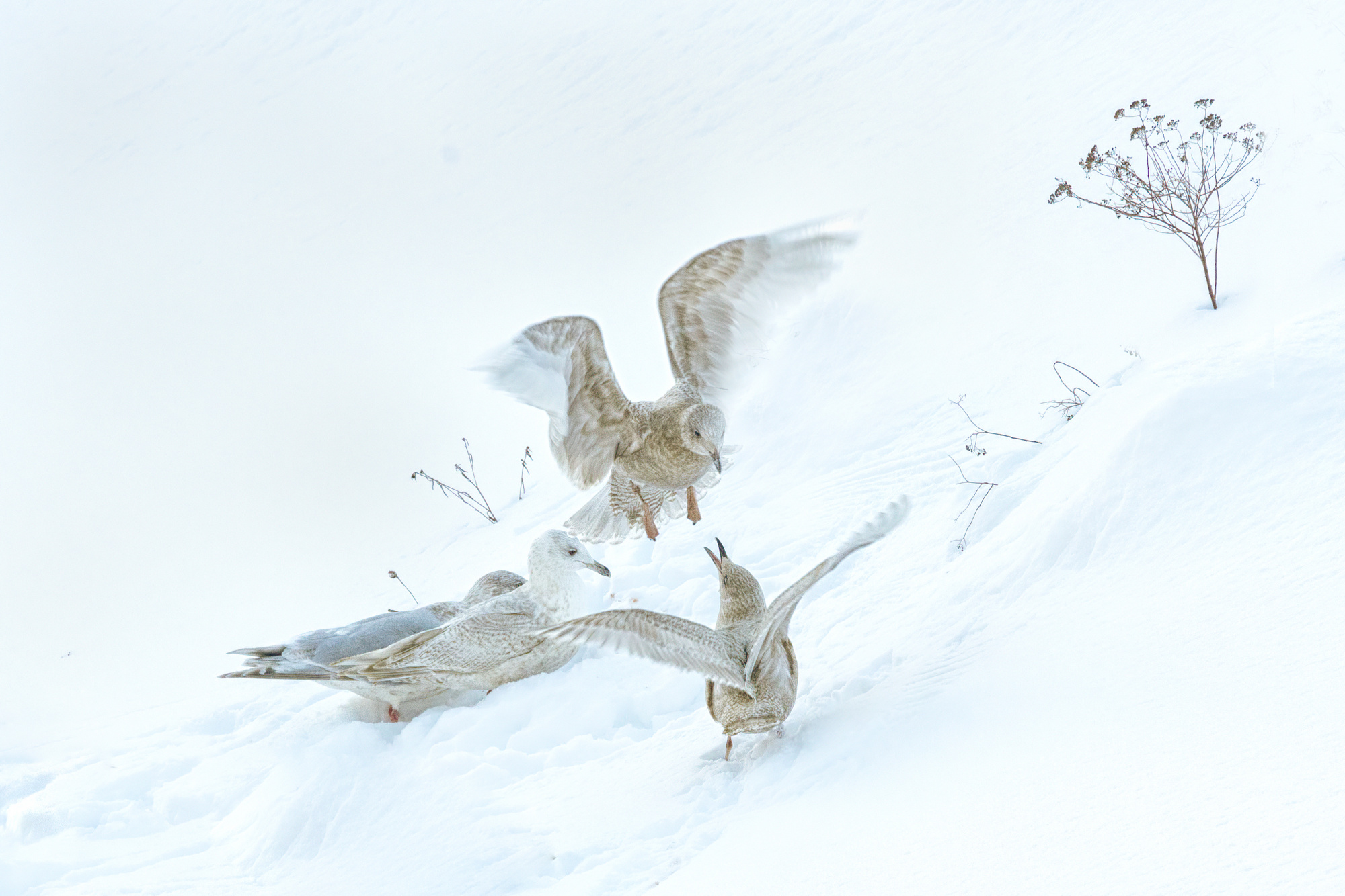
Welcome to the Critique forum. I like your image very much and I do high key photography myself sometimes. Looking at your picture, I do find that there is too much white on the top left quadrant (even for a high key) and I find that the dried up flowers on the right was too close to the edge.
So I brought your picture in Photoshop Elements 21 and did the followwing.
First, I moved the dried flowers closer to the birds. Then I cropped the picture tighter, in a 4x6 format.
I then added some details and Tonal Contrast in Nik Collection Color EfexPro. I concentrated these changes mostly on the birds and less on the snow around them.
Then I adjusted the levels a little to brighten the image and add a little more contrast.
I adjusted a little the brightness in the top left section because it was as blinding as snow in winter! To do that, I used the Burn tool.
Et voilà!
Hope these suggestions are helpful and thank you for posting your picture here for us to look at.
Lucie s.c.
Shot at f11, ISO 800, shutter speed 1/500 sec. Intentionally exposed to the right. I was looking for a more painterly style so the snow is more blown out. Looking for those second set of eyes feedback. Thanks, Kim
Hello Kimberley , (I Hope this is the right Kimberley! )
Welcome to the Critique forum. I like your image very much and I do high key photography myself sometimes. Looking at your picture, I do find that there is too much white on the top left quadrant (even for a high key) and I find that the dried up flowers on the right was too close to the edge.
So I brought your picture in Photoshop Elements 21 and did the followwing.
First, I moved the dried flowers closer to the birds. Then I cropped the picture tighter, in a 4x6 format.
I then added some details and Tonal Contrast in Nik Collection Color EfexPro. I concentrated these changes mostly on the birds and less on the snow around them.
Then I adjusted the levels a little to brighten the image and add a little more contrast.
I adjusted a little the brightness in the top left section because it was as blinding as snow in winter! To do that, I used the Burn tool.
Et voilà!
Hope these suggestions are helpful and thank you for posting your picture here for us to look at.
Lucie s.c.
Thank you Lucie, I really like your edits and a great idea to move the flower closer, I debated whether to crop it out but felt it added something. Taking down the brightness too was a great suggestion. ( Kimberly without the "e"!!) Kim is easier
Shot at f11, ISO 800, shutter speed 1/500 sec. Intentionally exposed to the right. I was looking for a more painterly style so the snow is more blown out. Looking for those second set of eyes feedback. Thanks, Kim
Hello dKimberley , (I Hope this is the right Kimberley! )
Welcome to the Critique forum. I like your image very much and I do high key photography myself sometimes. Looking at your picture, I do find that there is too much white on the top left quadrant (even for a high key) and I find that the dried up flowers on the right was too close to the edge.
So I brought your picture in Photoshop Elements 21 and did the followwing.
First, I moved the dried flowers closer to the birds. Then I cropped the picture tighter, in a 4x6 format.
I then added some details and Tonal Contrast in Nik Collection Color EfexPro. I concentrated these changes mostly on the birds and less on the snow around them.
Then I adjusted the levels a little to brighten the image and add a little more contrast.
I adjusted a little the brightness in the top left section because it was as blinding as snow in winter! To do that, I used the Burn tool.
Et voilà!
Hope these suggestions are helpful and thank you for posting your picture here for us to look at.
Lucie s.c.
Thank you Lucie, I really like your edits and a great idea to move the flower closer, I debated whether to crop it out but felt it added something. Taking down the brightness too was a great suggestion. ( Kimberly without the "e"!!) Kim is easier
Glad you like the suggestions I made. I too thought the flowers added something and should not be cropped out.
I corrected your name in my post!
Greetings from a fellow Canadian!
Lucie
Hello, Kim
Welcome to the forum. This is a beautiful image. I really like it. There are few things s though. First of all the highlights are too bright. This prevents us to look less than needed at the photo. The other thing I want to stress is about the composition I think coming closer to the subject would be better here. I prepared an example for you. First I cropped your image and later I increased the vibrancy, texture, clarity and I enhanced the Inge by increasing dehase. The result looks quite painterly I think. Have good light. Cicek Kiral...
Thank you Cicek, what a wonderful enhancement. I love it
