|
|
|
|
Hello, everyone.
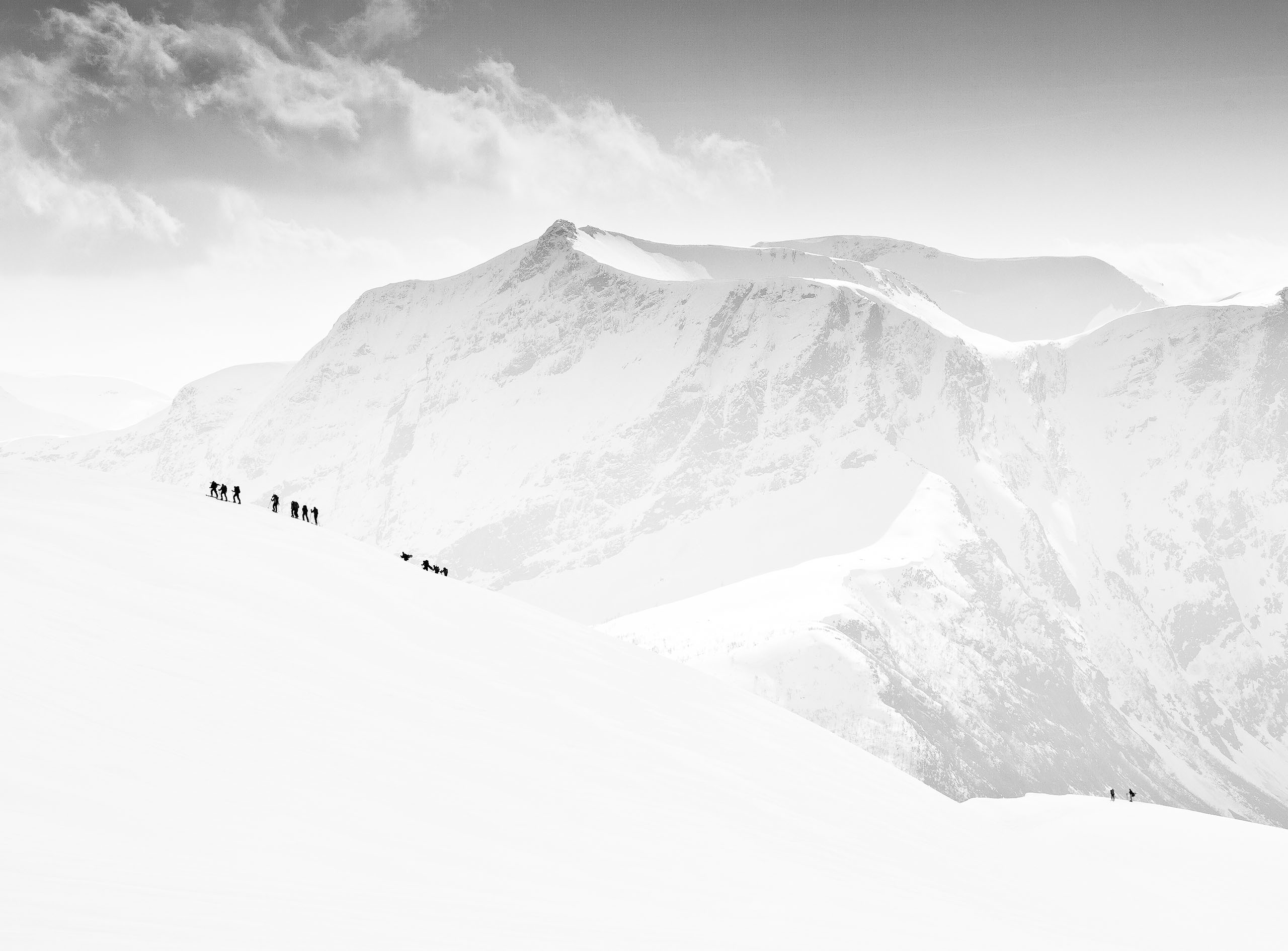
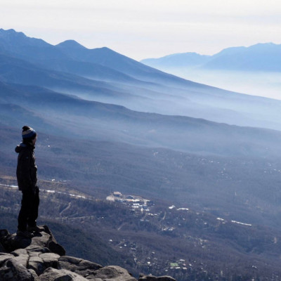
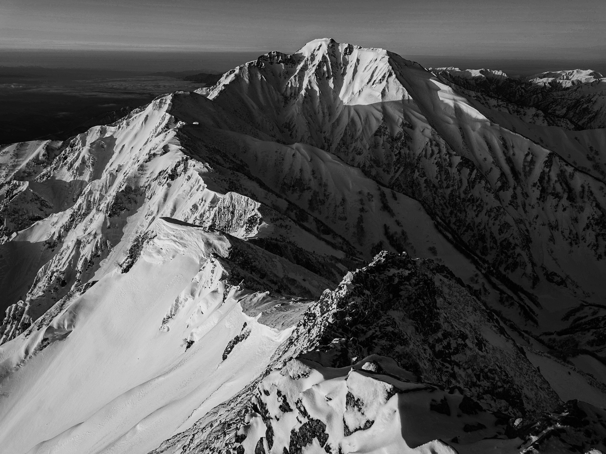
I am a photographer with a focus on mountain landscapes. My goal is to create work that conveys the size and power of the mountains, but since I am a beginner, I always have trouble developing the images using Photoshop and Lightroom. How can I develop my photos to get closer to the kind of work published by landscape photographers around the world? I would like to learn about the basic methods of developing, such as how to create light and color.
I would also like to know what I should pay attention to when photographing such a dynamic subject. (For example, should I shoot with multiple focus positions for depth of field composition? etc.)
Info
Camera: FUJIFILM GFX50S II
Lens: GF32-64mmF4 R LM WR
Shutter Speed: 1/15
Aperture: f/20
ISO: 100
Best Regards.
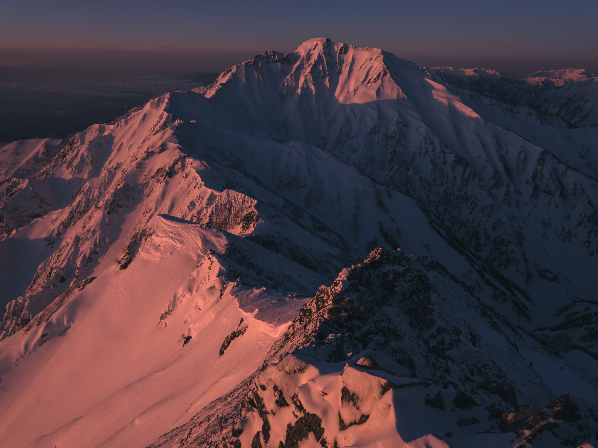

Shiki Welcome to " The Real Critique " and thank you for given us a try. - A very good high qulaity image you have there Congratulation - First may I address your last comment in days of old before focus stacking landscape photographers the world over produced many great works using in camera depth of field please learn this way first using F11 or F13 and picking the right spot to get that special depth.
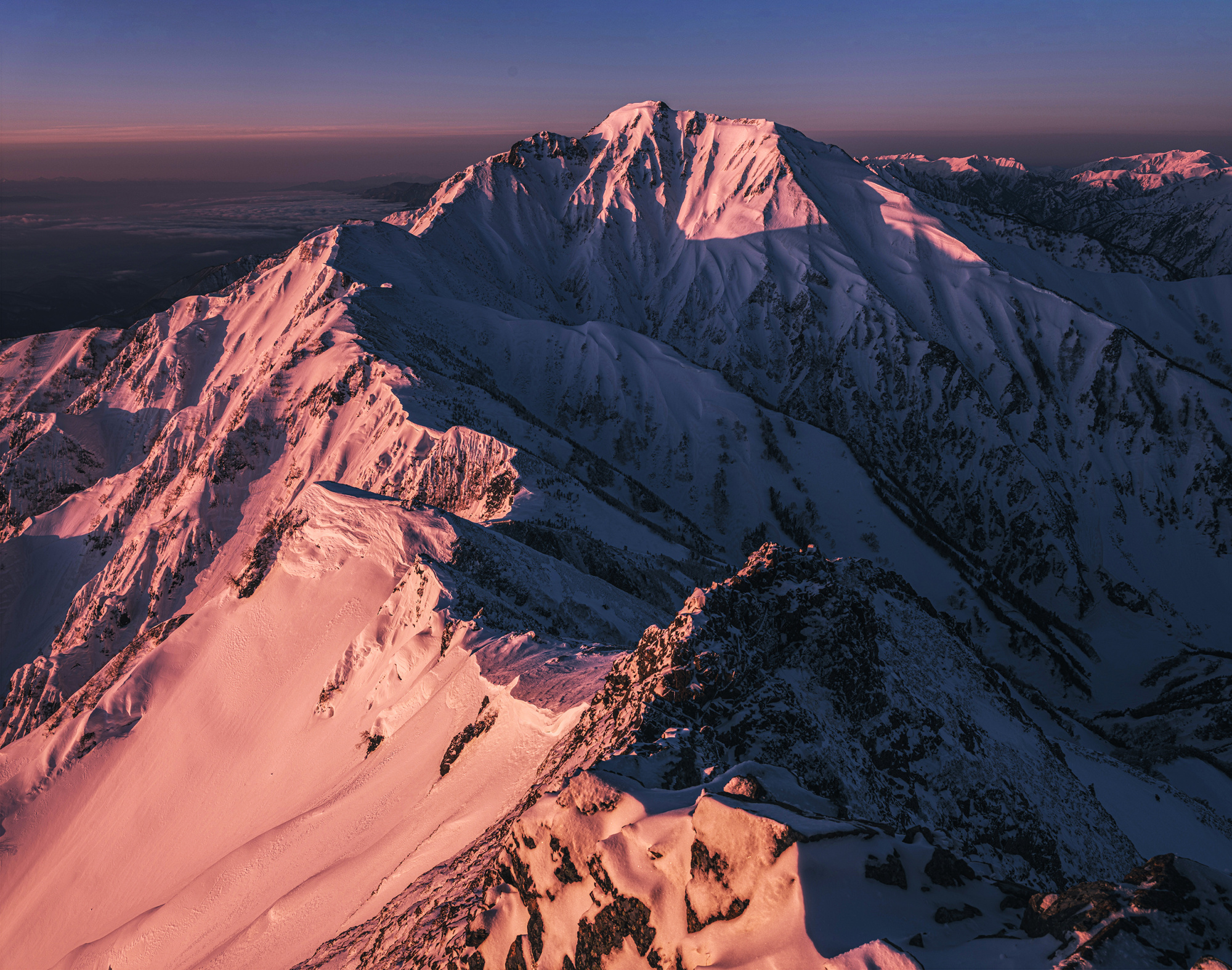
I did take your fine image back into Photoshop so I could see up close this is what I had a play with - This is just my take on your image - Camera Raw - Exposure +50 - Clarity +10 - Shadowss +30 - Dehaze +20 - All to add better contrast and colour - Love your composition so I changed nothing in that department - I did some dodge work on the snow areas - Last I then used Nik Tools Tonal Contrast on the moutain only and not the sky - add texture and the power of impact.
Thanks for your quick reply!
I will take your work and try it myself.
I had learned very little about the process of dodge work, so I'll check it out and try it myself.
I would like to know about other developing techniques you use in your landscape photography. If you list keywords, I can look them up myself.
Also, why did you not adapt Nik Tools Tonal Contrast to the sky?
Thanks
Nik tools Tonal Contrast adds texture the sky is better looking a little soft. Try the dodge tool with Opacity set at around 18% and paint like an artist. if you go too far take the histoy back a notch...
Hello Shiki,
thank you very much for uploading an interesting photo to this forum.
I love photographing mountains. I see that you use an interesting medium format camera, so the details should be shown with a great level of reproduction.
Unfortunately, that's a bit missing from your frame. My proposal for your photo is different from my friend Danny's. I proposed to show this frame in black and white. For me, this frame becomes more expressive and stronger. I edited in PSCC 2023 and Camera Raw. I also used the PS add-on - Silver Effects.
In addition, in PS I removed a spot in the upper part of the photo (either there is a stain on the matrix or the lens was dirty) and a few small elements in the lower part of the photo that "irritated" me a bit :-) .
I envy the place and time of taking the photo. Of course, this is my vision of your photo.
Kind regards
Slawomir Kowalczyk - SC.
Daniel Springgay Thanks your advice! I've never used Nik tools, so I'll give it a try.
Slawomir Kowalczyk Thanks for your proposal!! I have a great camera, but I'm not getting the most out of it.
Your proposal made my photos more detailed and more powerful!
What made you think black and white was better?I would like to know your criteria for choosing color or monochrome.
Also, it looks like I wasn't looking carefully at my photos.From now on, I will check not to miss even the smallest details.
Shiki,
Your photograph is quite spectacular. Many mountain photos are made from below, looking up from a distance. Yours is more like a portrait - taken from the subject's eye level. The lighting and the colour add a lot of drama.
I made a screen shot and adjusted it in several ways with basic Photoshop tools. Photoshop often has several ways to make an adjustment - but sometimes one will work better than another.
First, I leveled the horizon by using 'Perspective Crop'. It can be found under the regular Crop tool by right-clicking on the small black triangle at the bottom right of the Crop tool icon. By pulling the top right corner down, the frame is stretched upwards to make the horizon appear more level.
Since the mountain is very close to the top of the frame I added some space there using the 'Content Aware' feature of the standard Crop tool. To do this it's necessary to do two things - de-select 'Use Classic Mode', and select 'Content Aware'. Outline the whole picture with the Crop tool, then pull the top upwards, click Enter, and wait until Photoshop creates the new pixels to fill in the blank space.
The photo seemed dull, so I brightened it with 'Image>Adjustmets>Brightness/Contrast'. I gave it +50 for both brightness and contrast.
The highlighted ridge makes a good leading line to draw viewers into the frame and towards the far peak. To accentuate this 'flow' to the composition, you can lighten the far peak slightly and darken the slope at the bottom left a little. Viewers will go to the brightest part of an image, and you want this to be the peak. This can be done by selecting the area with the Quick Selection Tool and then adjusting the tone with 'Image>Adjustments>Brightness/Contrast', or with the Dodge and Burn tools. Subtle changes are best so that the image does not begin to look overly manipulated.
A suggestion we often make here is to use the controls in 'Filter>Camera Raw Filter'. In the 'Basic'section of that filter you can make many changes. The 'Texture', 'Clarity', and 'Dehaze' sliders are particularly useful for adding drama to subjects.
I hope that's useful to you, and I hope we'll see more of your work here in Critique.
. . . . Steven, senior critic

Dear Shiki,
I think you were rather looking for some hints how to improve and the posted photo was a kind of erference where you stand in photography / what your preferences are.
Unfortunately there are not many photos in your portfolio here and neither on Instagram, which makes it hard to learn about your work.
My colleages gave you a few hints already, mostly refering to the limited tonal range in your photo(s), something I see in all your photos. I'm not a big fan of deep dark tones in color landscape photography, it makes a subject appear heavy. You avoid hard blacks, too, but at the other end of the range I'd waste less potential. The photo above has about 30% of spectrum unused on the right, no highlights. Like Danny and Steve already mentioned there are ways to fix that.
I think other aspects you could look into, which may take you a few steps further on your way to a good landscape photographer are:
- The principle of having a foreground, middleground and background, to convey depth. You usually have a foreground, but it's not really close to the lens, to drag the viewer into the picture. Except for your "A Little Light in the Morning", but there you toned it down so far it does noot have a real appearance or weight in the photo.
- Composition by leading lines. A lot of landscape photographs use elements leading to that one, main subject in a photgraph. That could be the lit top of the hill in your "A Little Light in the Morning". A rock formation, a path, anything that presents a line makes your photograph stronger when it points to your subject.
I hope you don't mind if I give an example from my own work, that's simply the one I know best... https://1x.com/photo/2368858
The coast line, the rocks, even the structure in clouds, the hill, everything in this leads to the ruin. The photo is packed with leading lines. That's what I mean.
- Luminosity mask to set highlights with light, colors, sharpness or contrasts. TK8 is for example a very complex, but also powerful tool to do fine, gradual modifications in landscape photography. It's tough to learn, but I guess 80% of highly altered great landscape photos here on 1x were edited by luminosity masks. It gives you control over colors or light in a very subtile way, and you can work non-destructive with the selections based on color ranges or tonal ranges to craete what ever you want. Have a look at this technology, there are dozens of good tutorials on Youtube and other channels.
- Stacking multiple frames is certainly also a possibility to get front-to-end sharpness. I usually shoot at f/16 with a wide angle, which already gives me a DOF from 1 meter to infinity. But if you pull subject together by a long lens, for example an alley where you don't want the gaps between trees to appear, using 200mm, you may need to take multiple shots to have it sharp front to end. Usually you focus on 1/3rd of the distance you want to cover sharp, but with long lenses this can be a few meters or even centimeters just.
Take all this as food for thought, not a critique of your posted photo. I hope it gives you some indications aout what to learn next or look for in next shots.
Best regards,
Mike
Steven T Thank you for your develop idea!!
I did not develop the film by lightening or darkening parts of the film with the leading line in mind.
Others have made similar changes, but it still seems to be darker overall.
I will try to raise the brightness in the future.
Mike Kreiten Thanks for your many advices not limited to your developing!
I am new to photography (Therefore, I do not have a portfolio of work to speak of.) , so I am still not very good at composing my images with an awareness of the leading line from the overall view to the subject. This year, my goal is to shoot with thorough awareness.
At the same time I will learn to develop with Luminosity mask.I did not know TK8. I will look into it.
Since I am not a native English speaker and I am reading your comments while using an interpreter, I do not know if I understand everything you are trying to say. Therefore, I will read it many times to prepare for the next shot.
