|
|
|
|
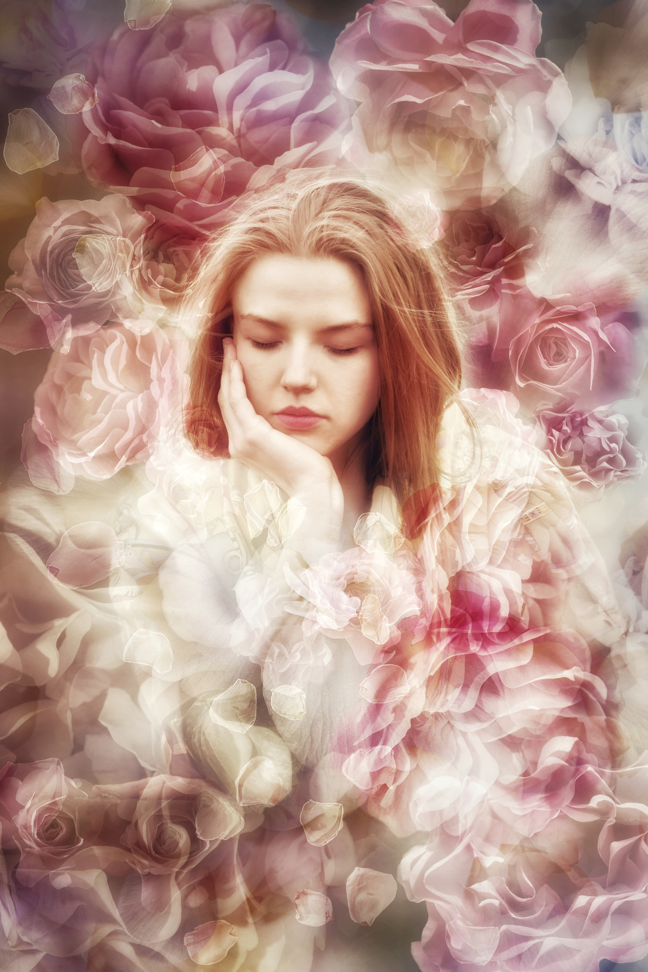
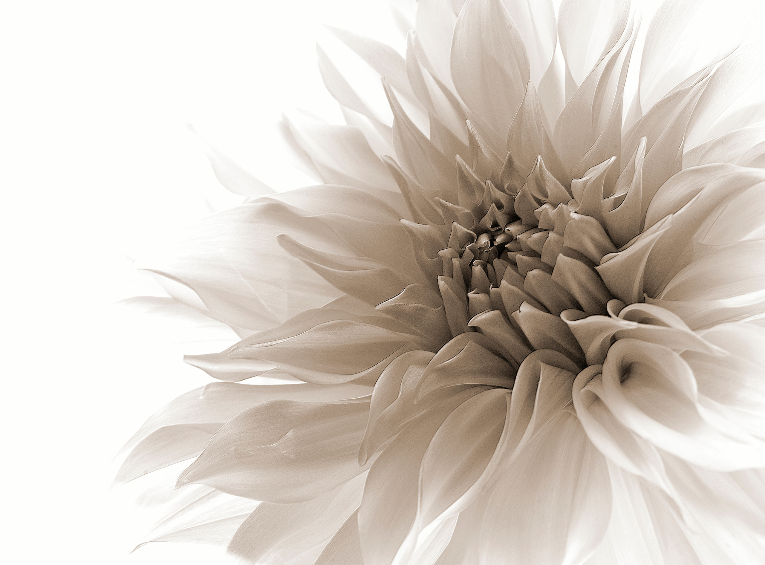
Creative editing portrait. A woman wearing a transparent, ethereal cloak of roses over her shoulders. Perhaps she is wearing a dream, an imagined garden. She is herself distanced from reality. I used Lightroom to adjust the portrait to what I wanted to do with it. I used Adobe Photoshop to make the collage of rose photos I took in my garden. I made two variants. The lighter one which I like more and I submitted, was rejected by the senior critics with 3%. I didn't expect this result so I would like to understand why was this creation so worthless.

Dear Ludmila, this is beautiful work, the lighter version being my personal favourite. We all have to deal with these dubious and bad evaluations in user curating. The pre-evaluation by the people thought of 1x does not work and only creates frustration.
Best regards
Udo
Dear Ludmila, this is beautiful work, the lighter version being my personal favourite. We all have to deal with these dubious and bad evaluations in user curating. The pre-evaluation by the people thought of 1x does not work and only creates frustration.
Best regards
Udo
Thank you, Udo, for your message. I also like the lighter version. Point is the user curating resulted in a better score than the senior curators. I do not feel frustrated, just curious. 52% appreciation by the users, 3% from the expert curators. Anyway thank you for taking the time to look at my image and give me your opinion.
Ludmila,
There has been a lot of discussion lately about the wild variations in the percentage scores. We here in the Critique Forum are given no special insight into the workings of Member Curation, so we can't offer an explanation or excuse. We have theories only. My personal theory is 'Photo Fatigue' affecting the voters causing them to click the 'Reject' button more and more.
If you've visited the Critique Forum before you know that our usual procedure is to take a screen shot and re-edit it to show how we think the image might be improved. I'm reluctant to do that with your 'Pale Rose' because I'm sure you have already edited it in full. Based on the work in your gallery, I'm guessing you've studied this image pixel by pixel and have made all the adjustments needed to make the image express what you want it to.
Nevertheless, I had some ideas - more blur in the background, moving the subject slightly off center, making the frame more 4x5 rather than the original 4x6. That can be done with Photoshop's 'Scale' tool, so there is no detail lost by cropping.
Oh, and the colour - a bit more pink, a bit less yellow. Just a few subtle changes. . . . :-)
If you'd rather not see my suggestions, I'll refrain. I love to edit, so when I see a photo that gives me ideas I want to start clicking to see what will work.
. . . . Steven, senior critic
Thank you, Steven, for your message. I really appreciate your input. In the Critique forum I uploaded two variants. This one here is not the variant I uploaded and submitted for curation - the lighter and "pinkier" one is. I suppose you can see that one posted in this forum too - it is lighter and I prefer it. It is interesting what you say about the frame and I'll try it. Also about shifting the subject. However I always make my images 2:3 or square, I am quite drawn to these proportions no matter how silly it may sound. Yes, and I always study pixel by pixel every work on my large iMac screen. And more than once. I was very pleased with this floral portrait and I was sure it will be appreciated and added to my portfolio so I still wonder why it was so adamantly rejected...
